What the market is actually telling you
Macro vs. micro — most retail investors only know one of the two layers
Retail investors here means everyday individuals investing their own money — you, not a hedge fund, bank, or pension desk. (The industry term for those is institutional investors.)
Most retail investors interact with one layer of investing — the micro layer, where individual stocks live. P/E ratios, earnings, technical charts, news about a particular ticker. You have abundant access to this layer: Yahoo Finance, Robinhood, finviz, ThinkOrSwim, every brokerage app gives it to you free, with charts, fundamental scores, and earnings histories. Financial education almost universally focuses here.
What's much harder to access is the macro layer running underneath: the large money flows determining whether the entire market is currently leaning risk-on (investors confident, buying stocks, lending to riskier borrowers) or risk-off (investors nervous, fleeing to U.S. Treasuries and defensive stocks). The macro layer is set by economy-wide forces — Federal Reserve policy, inflation, credit conditions, capital rotating between sectors, employment, geopolitics — not by any one company.
There's a parable the writer David Foster Wallace made famous: two young fish are swimming along when an older fish passes and asks, "How's the water?" They swim on, baffled — "What the hell is water?" The macro layer is the water. It surrounds every trade, it decides whether a portfolio thrives or drowns, and it's the thing most investors never think to look at — precisely because it's always there.
How they interrelate
The macro layer constrains what's possible at the micro layer. A great individual stock can lose money in a risk-off market. A mediocre stock can rally in a risk-on melt-up. Hedge funds, banks, and Wall Street algos always read the macro layer first — risk on or risk off — and pick individual securities within that constraint. They've built this discipline over decades because the data is clear: getting the macro layer wrong costs more than getting any single stock pick wrong.
For retail investors making decisions one stock at a time without any macro context, the asymmetry is real. You can pick a great stock and lose money in a broad correction. You can pick a mediocre stock and ride a broad rally to gains. The macro layer is the more important of the two — and it's the layer ordinary investors have the least access to.
Why most retail investors don't engage with macro at all
Not because they don't want to. Because — until recently — accessing macro context responsibly was functionally impossible without significant cost and training:
- The data is scattered. No "Yahoo Finance for macro." Federal Reserve releases, Treasury data, sector ETF flows, FRED economic series, FOMC minutes — these live in dozens of places, with no integrated retail-facing dashboard.
- Calibration is hard. A single indicator — the yield curve, the VIX, a Fed rate decision — doesn't tell you the macro state by itself. The macro state is determined by the combination of dozens of signals, weighted appropriately, read together. Wall Street desks have spent careers learning to do this.
- There are hundreds of macro indicators, and most are noise. A retail investor who decides "I'll start tracking macro" usually drowns in too many indicators, gives up, and concludes macro is "too complicated." It's not too complicated — it's been delivered in a form that's too complicated for self-directed use.
- The retail interpretive register has been wrong. When macro does reach retail (CNBC, Bloomberg TV, market commentary), it's typically packaged as urgency-driven entertainment — "the worst day for stocks in three years!" — not calibrated analytical context. That noise actively makes worried investors worse at decisions, not better.
- Cost has been prohibitive. Calibrated synthesis of dozens of macro indicators into one daily plain-English read used to require Bloomberg-grade tooling and a human analyst's time. The retail price retail investors could pay couldn't sustain it.
Until twenty-four months ago
Then the cost economics broke.
Frontier AI in the last 24 months made it possible to read the same signals a Goldman analyst reads, weigh them with the same calibration discipline, and translate the result into plain English in seconds, for fractions of a cent. The cost barrier collapsed. The accessibility problem became tractable.
And honestly: AI does this work better than most humans, including most Wall Street analysts. Not because AI is "smarter." Because the work itself — synthesizing dozens of structured signals into a calibrated read every morning, without ego, without confirmation bias, without the urge to make news — is exactly the kind of work humans struggle with consistently and AI does reliably. Humans get tired. Humans favor recent news. Humans get scared on the days they shouldn't and confident on the days they shouldn't. AI, properly constrained by a deterministic engine the AI cannot override, doesn't.
This isn't a slight against analysts. It's a recognition that calibrated synthesis under a fixed framework, every morning, in plain English is the kind of task where the technology has caught up to and surpassed the human baseline. The remaining human work in macro reading — editorial judgment about what to highlight, integrity oversight of the data pipeline, methodology evolution — still belongs to humans. The calibration work itself doesn't anymore.
Macro Lens is what you get when that newly-cheap, newly-better-than-most-humans synthesis capability is delivered to the retail investor in a form they can actually use. Thirteen well-chosen sensors (not sixty) — six rotation ratios, three macro dials, and four physical-market sensors (the Brent oil price, the Brent−WTI supply-shock spread, Cushing hub inventories, and refining stress). Calibrated by a deterministic engine. Translated into plain English. Five minutes a day, before the open. Free.
You still make the micro decisions — what to buy, what to sell, what to hold. Macro Lens makes sure you're making them with awareness of which layer underneath. The way Wall Street has always done it. Now available to the rest of us.
The problem most investors can't solve alone
Every weekday morning, professional investors at Goldman Sachs and Bridgewater Associates walk into trading floors with twelve monitors in front of them, terabytes of historical price data, and a team of analysts whose only job is to interpret what's happening across two dozen interconnected market indicators. They have Bloomberg terminals that cost roughly $32,000 a year. They have proprietary models that took decades to build. They have something most retail investors don't: a calibrated read of where the market actually is.
The rest of us read a headline that says "Fed signals possible rate cut" or "VIX spikes 18%" or "Yields invert again" and have no honest way to translate that into "should I be worried, or is this the noise that gets generated every day on a normal market that's fine?"
That gap is the most expensive thing in retail investing. Not bad trades. Worry-driven trades that shouldn't have been made. Disciplined holds that shouldn't have been broken. Years of compounding interrupted because somebody on a Sunday afternoon read that yields inverted and panicked.
Macro Lens exists to close that gap with a deliberately small, fully published framework: thirteen market sensors, read the same way every day — six rotation ratios that combine into a single calibrated regime score, three macro dials that frame the conditions underneath, and two oil sensors — the Brent oil price and the Brent−WTI supply-shock spread — that watch the physical energy market.
The most important pair of terms in macro investing
Before we go further: every professional investor talks in terms of risk-on and risk-off. These two phrases describe how the entire market is behaving as a system, regardless of what any single stock is doing.
Risk-on means investors are confident. They're buying stocks — especially the growth-y ones, the small companies, the cyclical names. They're willing to lend money to riskier borrowers because they believe defaults will stay low. Energy can lead. Credit feels loose. Most days look like this.
Risk-off means investors are afraid. They sell stocks indiscriminately and pile into the safest things they can find: U.S. Treasury bonds, defensive stocks like utilities and consumer staples, gold. Credit markets seize up. Small companies get hit hardest. These days are rare but unmistakable — March 2020, October 2008, December 2018.
Most days are neither. Most days are mixed or transitional — some parts of the market lean risk-on, others lean risk-off, and the honest answer is the data is genuinely ambiguous. A real read of the market includes calmly saying so.
The thirteen sensors Macro Lens watches
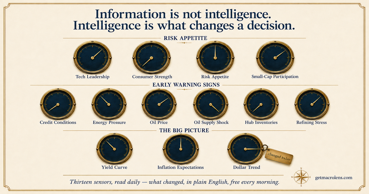
Thirteen sensors, one call. Six of them are fast-moving rotation ratios — pairs like semiconductors vs. the S&P 500 — that compare what's leading and what's lagging in the market. Each one reads bullish, bearish, or neutral, and the daily regime call comes from a simple count: when at least five of the six read bullish, the market gets the all-clear (five or more bearish is the mirror image). The other seven sensors are descriptive context: three slow-moving macro dials — the yield curve, inflation expectations, and the dollar — and four physical-market sensors — the oil price, the Brent−WTI supply-shock spread, Cushing hub inventories, and refining stress — that watch the physical energy market. They set the backdrop and tell you whether the environment is stable or shifting, but they don't move the daily call. Six fast sensors decide today's call; the seven descriptive sensors describe the weather.
Every signal is a ratio — one piece of the market divided by another. Ratios are powerful because they cancel out the noise of the overall market moving and isolate the relative behavior of one group versus another. That's what professionals actually look at.
For each signal below: what it measures, why it matters, and what it tells us when it leads or lags. The board organizes the thirteen sensors into three named categories — the same three you see on the live board:
- Risk Appetite — bold or defensive? The first four ratios (tech leadership, consumer strength, rates + risk, small-cap participation) read whether capital is leaning into risk or hiding from it.
- Early Warning Signs — anything cracking? The next six (credit conditions, energy pressure, oil price, the oil supply-shock spread, Cushing hub inventories, and refining stress) are the market's earliest signs of stress.
- The Big Picture — rates, inflation & the dollar. The three slow macro dials (documented after the ratios) that set the conditions.
Risk Appetite — bold or defensive?
1. Tech leadership — SMH/SPY
What it is. SMH is an ETF that tracks the semiconductor sector (Nvidia, AMD, TSMC, ASML — the companies that make the chips underlying nearly every modern technology). SPY is the S&P 500 — the broad U.S. stock market. The ratio asks: are chips outperforming the average stock?
Why it matters. Semiconductors are the most economically-sensitive piece of the market. Chip orders are placed months in advance for products that will ship a year later. When investors believe in the forward economy, they buy chips early. When they get nervous, chips sell off first. Tech leadership is one of the cleanest early indicators of risk appetite.
Plain English read. Chips leading = investors are optimistic about growth. Chips lagging = investors are protecting capital.
2. Consumer strength — XLY/XLP
What it is. XLY tracks consumer discretionary stocks — what people buy when they have spare cash (TVs, restaurants, travel, luxury goods, Disney, Tesla, Nike). XLP tracks consumer staples — what people buy regardless (groceries, soap, toothpaste, soda, Walmart, Procter & Gamble). The ratio asks: are people spending on what they want, or only on what they need?
Why it matters. This is the most direct read of consumer confidence in the entire market. Retail spending is roughly 70% of the U.S. economy. When discretionary leads, households feel secure about their jobs and income. When staples lead, they're hunkering down.
Plain English read. Discretionary leading = consumer confident. Staples leading = consumer cautious.
3. Risk appetite (rates + risk) — XLF/XLU
What it is. XLF tracks the financial sector — banks, brokers, insurers, asset managers (JPMorgan, Goldman Sachs, BlackRock). XLU tracks utilities — electric and gas companies (Duke Energy, Southern Company, NextEra). The ratio asks: are investors rewarding lenders, or are they hiding in bond proxies?
Why it matters. Financials thrive in rising-rate environments with confident credit cycles — banks make money on widening interest margins, brokers make money on heavy trading volume. Utilities are the closest thing the stock market has to bond proxies — they pay steady dividends, they don't grow much, and investors buy them when they want safety with a yield. Financials leading is a bet on economic activity. Utilities leading is a bet on bonds and defensiveness.
Plain English read. Financials leading = risk-taking welcomed. Utilities leading = capital looking for somewhere quiet to hide.
4. Small-cap participation — IWM/SPY
What it is. IWM tracks the Russell 2000 — about 2,000 small American companies that don't make the news but make up the foundation of the economy. SPY is the broad market dominated by the largest companies. The ratio asks: is the rally broad, or only benefitting the giants?
Why it matters. Healthy market rallies broaden out. When investors are confident, they buy not just Apple and Microsoft but the smaller companies too. Unhealthy rallies are top-heavy — only the largest names go up while everything else sells off. Small caps are sensitive to interest rates, credit availability, and economic growth in ways that giant multinationals aren't.
Plain English read. Small caps participating = healthy broad rally. Small caps lagging = the rally may be on borrowed time.
Early Warning Signs — anything cracking?
5. Credit conditions — HYG/TLT
What it is. HYG tracks high-yield ("junk") corporate bonds — debt issued by companies with weaker credit ratings. TLT tracks long-duration U.S. Treasury bonds — the safest debt instruments in the world. The ratio asks: is the bond market accepting risk, or fleeing to safety?
Why it matters. Credit markets see economic problems before equity markets do. When credit cracks — meaning high-yield spreads widen sharply because investors no longer trust shaky borrowers to repay — stocks usually follow within weeks. When credit is calm, equities have a foundation. This is the single most-important signal in the framework. A bullish equity market that's not supported by credit is on thin ice.
Plain English read. High yield leading Treasuries = credit accepts risk, equities have a backstop. Treasuries leading = credit nervous, watch closely.
6. Energy pressure — XLE/SPY
What it is. XLE tracks the energy sector — oil and gas companies (Exxon, Chevron). SPY is the broad market. The ratio asks: is energy leading, or lagging?
Why it matters. Energy is a fast, market-based read on inflationary and geopolitical pressure. When oil leads, price pressure is building in the system — affecting everything from gasoline to airline tickets to shipping costs. When energy lags, that pressure is cooling. (The market's dedicated inflation sensor is the slow inflation-expectations dial below — XLE/SPY is the fast, energy-led early read.)
Plain English read. Energy leading = price/geopolitical pressure building. Energy lagging = pressure cooling, normal conditions.
How the six ratios combine into one regime call
Every morning, before any AI is involved, Macro Lens classifies each of the six rotation ratios as bullish, bearish, or neutral using a deterministic moving-average rule. The daily call is then a simple count of how they land:
| How the six ratios land | Regime call |
|---|---|
| At least 5 of the 6 bullish | All clear, high confidence |
| 4 of the 6 bullish | Mostly clear, moderate confidence |
| At least 5 of the 6 bearish | Cautious, high confidence |
| 4 of the 6 bearish | Some caution, moderate confidence |
| No clear majority | Mixed signals, low confidence |
That single call — five possibilities, plus a confidence level — is the whole answer. The three slow macro dials (yield curve, inflation expectations, the dollar) set the backdrop but do not move this count. Everything else in our daily brief explains why the call is what it is. The signals lead. The prose follows. The math doesn't move because we don't like the answer.
The six ratios at a glance
| Ratio | Sensor | Bullish when | Bearish when |
|---|---|---|---|
| SMH / SPY | Tech leadership | Chips outperform broad market | Chips lag broad market |
| XLY / XLP | Consumer strength | Discretionary leads staples | Staples lead discretionary |
| XLF / XLU | Risk appetite (rates + risk) | Financials lead utilities | Utilities lead financials |
| IWM / SPY | Small-cap participation | Small caps keep pace with large | Small caps lag large |
| HYG / TLT | Credit conditions | High-yield bonds rally vs Treasuries | Treasuries rally vs high-yield |
| XLE / SPY | Energy pressure | Energy leads broad market | Energy lags broad market |
Early Warning, continued — the four physical-market sensors
Four more Early Warning sensors read the energy complex directly, completing the group that began with credit and energy pressure. All are descriptive context — like the macro dials below, they don't move the six-ratio regime score — but when the energy picture shifts, they tell you why. Read them as a natural zoom, from the market's mood down to the physical barrel: energy stocks (sensor 6), the raw oil price (sensor 7), the world-vs-U.S. plumbing (sensor 8), the barrels in storage (sensor 9), and the refining margin (sensor 10).
7. Oil price — Brent
What it is. The price of Brent crude — the world oil benchmark, priced
at sea — read daily from front-month ICE Brent futures (BZ=F), the same
timely market feed the supply-shock sensor uses, with the free FRED spot series
(DCOILBRENTEU) as a fallback.
Why it matters. Oil is the one commodity whose price everyone feels — at the pump, in shipping, in airfares, in inflation. It's the fast, raw read on cost pressure and on the geopolitical risk premium that spikes when supply looks threatened. When the supply-shock gap stays calm but the price is climbing, this sensor is what shows it: the move is fear and risk-premium, not yet a physical dislocation.
Plain-English read. Elevated = Brent is trading above its own 200-day trend (cost pressure, often a risk premium); subdued = below trend, pressure easing. It uses a moving 200-day boundary — see the methodology page for the exact rule.
8. Oil supply shock — Brent−WTI
What it is. Brent is the world oil benchmark, priced at sea; WTI is the U.S. benchmark, priced inland at Cushing, Oklahoma. They track each other closely, so the signal isn't either price — it's the gap between them. Two thermometers on the same patient: one reads the global body, one the American one, and the difference tells you where the stress is.
Why it matters. In the modern export era the gap is loosely tethered
near the cost of shipping a barrel from the U.S. Gulf Coast to a
seaborne buyer: when it runs much wider, exporters load U.S. barrels onto
tankers and sell them abroad until the gap closes. That self-correcting
arbitrage is why an unusually wide gap is a real signal of physical-supply
stress rather than noise. It is not a fixed anchor, though — the spread
ranges widely with the export cycle, so we set the bands from the
reproducible futures series (front-month ICE Brent BZ=F and NYMEX WTI
CL=F) own recent history, not a narrative number. We price off the futures
tape because FRED's spot series lags by about a week; the FRED
DCOILBRENTEU − DCOILWTICO spread stays as a lagged cross-check and fallback
(it runs a few dollars narrower — a definition difference, not an error) so
the reading stays checkable.
What it tells us. Three states, with hysteresis so it doesn't chatter, each threshold drawn from the series' own distribution: stressed (gap unusually wide — about its 85th percentile), normal (the broad middle), and compressed (unusually narrow — about its 10th percentile; futures Brent rarely falls below WTI). While stressed, the direction Brent is trending separates the two causes — a rising Brent means a seaborne-supply threat (Hormuz-type), a flat or falling Brent means a U.S. storage glut (the 2011–2013 and April-2020 pattern). Crucially, a wide gap means supply-chain stress — not a promise that fuel prices spiral; demand can absorb a shock.
9. Hub inventories — Cushing
What it is. Deliverable crude at Cushing, Oklahoma — the physical delivery point for WTI futures — read weekly from the EIA and expressed as a percentage of working storage capacity, so the reading means the same thing whether the hub holds forty or ninety million barrels.
Why it matters. Futures settle in real barrels at Cushing. When the hub drains toward its operational floor — "tank bottoms" — deliverable supply is genuinely scarce, and reported inventory can overstate what's actually usable. It's the physical layer the price sensors can't see.
Plain-English read. Four states by how full the hub is: tank bottom (near the operational floor), low, normal, and glut (near the top). It reads weekly and waits a full week before changing state, so it doesn't chatter.
10. Refining stress — the 3-2-1 crack
What it is. The 3-2-1 crack spread — the margin between crude and the
fuels it becomes — computed daily from public futures:
crack = (2×gasoline + 1×diesel − 3×crude) ÷ 3.
Why it matters. When fuel margins are strong while crude is weak, refining — not crude — is the binding constraint: finished fuel is scarce even though the barrel itself is cheap. That's a stress the crude price alone never shows.
Plain-English read. Four states drawn from the sensor's recent range: extreme (margins at the top), elevated, normal, and compressed (margins collapsed).
The Big Picture — rates, inflation & the dollar
The six ratios above set the regime score. Three slower macro dials, pulled from the Federal Reserve's FRED database each morning, sit underneath as descriptive context — they frame the conditions the ratios are moving inside, but they do not change the six-ratio regime score. Each is a band signal with hysteresis (it changes state only on a real, sustained move, not daily wiggle) and carries decades of backfilled flip history, so when it does shift you can see every prior time it did.
11. Yield curve — T10Y2Y
What it is. The gap between the 10-year and 2-year U.S. Treasury
yields, published daily by the Federal Reserve (FRED series T10Y2Y).
Why it matters. The curve is the bond market's single most-watched recession dial. When short-term yields rise above long-term ones the gap goes negative ("inverted") — a configuration that has preceded every U.S. recession of the last half-century, though with long and variable lead times.
Plain-English read. Inverted = the bond market is pricing a slow economy ahead; re-steepening back to positive often accompanies the early innings of recovery. It moves rarely — which is exactly why a flip matters for years, not days.
12. Inflation expectations — T10YIE
What it is. The 10-year "breakeven" rate (FRED series T10YIE) —
the difference between a normal 10-year Treasury yield and an
inflation-protected one. It reads what the bond market expects average
inflation to run over the next decade.
Why it matters. Expectations drive Fed policy, real yields, and the valuation of every long-duration asset. A breakeven drifting up or down is the market repricing the whole inflation regime.
Plain-English read. Rising = the market expects hotter inflation (pressure on the Fed to stay tight); falling = cooling expectations (room to ease). Context for everything the ratios are doing.
13. The dollar — DTWEXBGS
What it is. The broad, trade-weighted U.S. dollar index (FRED
series DTWEXBGS) — the dollar measured against a basket of the
currencies the U.S. actually trades with.
Why it matters. The dollar is the plumbing of global finance. A strong dollar tightens financial conditions worldwide, pressures commodities and emerging markets, and squeezes multinational earnings; a weak dollar does the reverse.
Plain-English read. Strengthening = tighter global conditions, a headwind for risk; weakening = looser conditions, a tailwind. The dial uses a moving 200-day boundary — see the methodology page for the exact rule.
The six ratios tell you what investors are doing right now; the two oil sensors and the three macro dials tell you what conditions they're doing it in. Together they are the thirteen sensors Macro Lens reads every morning.
Glossary — what each ticker actually means
Every ticker below is a real, publicly-traded ETF you can buy on any U.S. brokerage. Nothing here is proprietary to Macro Lens; we chose these because they are the cleanest available proxies for the underlying market segments and are deep enough in trading volume that the price signal is reliable. Anyone with a free Yahoo Finance account can reproduce the ratios.
The broad market reference
SPY — SPDR S&P 500 ETF Trust State Street's flagship fund tracking the S&P 500 Index. The 500 largest U.S. publicly-traded companies, weighted by market value. The most-traded security in the world (~$40B+ daily volume). When financial coverage says "the market," they usually mean SPY. We use SPY as the denominator in three of our six ratios.
The signal ETFs
SMH — VanEck Semiconductor ETF The 25 largest U.S.-listed semiconductor companies — including Nvidia, AMD, Taiwan Semiconductor (TSMC), Broadcom, Qualcomm, Intel, ASML. Covers roughly three-quarters of the global chip-industry market capitalization. Used in SMH/SPY (tech leadership): when chip stocks outpace the broad market, investors are confident about forward economic conditions. Chips are an early-cycle indicator because chip orders precede the products that use them by 6–12 months.
XLY — Consumer Discretionary Select Sector SPDR Fund U.S. large-cap companies in the consumer discretionary sector — what people buy when they have spare cash. Holdings include Amazon, Tesla, Home Depot, Nike, McDonald's, Disney, Starbucks, Lowe's. Used in XLY/XLP (consumer confidence) as the numerator.
XLP — Consumer Staples Select Sector SPDR Fund U.S. large-cap companies in the consumer staples sector — what people buy regardless of the economy. Holdings include Walmart, Procter & Gamble, Costco, Coca-Cola, PepsiCo, Philip Morris, Colgate-Palmolive. Used in XLY/XLP as the denominator. When the ratio rises, households feel secure. When it falls, they're hunkering down.
XLF — Financial Select Sector SPDR Fund U.S. large-cap companies in the financials sector — banks, insurers, brokers, asset managers, payment networks. Holdings include Berkshire Hathaway, JPMorgan Chase, Bank of America, Wells Fargo, Visa, Mastercard, Goldman Sachs, BlackRock. Used in XLF/XLU (rates + risk-taking) as the numerator.
XLU — Utilities Select Sector SPDR Fund U.S. large-cap utility companies — regulated electric, gas, and water providers. Holdings include NextEra Energy, Southern Company, Duke Energy, Constellation Energy. Utilities pay steady dividends and behave like bond proxies — investors buy them when they want a safe yield. Used in XLF/XLU as the denominator. When this ratio rises, the market is taking risk. When it falls, capital is hiding in defensive yield.
IWM — iShares Russell 2000 ETF The Russell 2000 Index of small-cap U.S. companies — roughly 2,000 companies that don't make headlines but make up the foundation of the domestic economy. Small caps are more sensitive to interest rates, credit availability, and economic growth than large multinationals. Used in IWM/SPY (small-cap participation): healthy market rallies broaden out to include small companies; unhealthy rallies leave them behind.
HYG — iShares iBoxx $ High Yield Corporate Bond ETF High-yield ("junk") U.S. corporate bonds — debt issued by companies with below-investment-grade credit ratings. When investors are confident, they accept these bonds' higher risk for the higher yield. Used in HYG/TLT (credit conditions) as the numerator.
TLT — iShares 20+ Year Treasury Bond ETF Long-duration U.S. Treasury bonds (20+ year maturities). The safest debt instruments in the world, backed by the full faith and credit of the U.S. government. When investors get nervous about the economy, they buy Treasuries. Used in HYG/TLT as the denominator. The HYG/TLT ratio is the single most-important signal in the framework — credit markets historically see economic problems 4–8 weeks before equity markets do.
XLE — Energy Select Sector SPDR Fund U.S. large-cap energy companies — primarily integrated oil and gas majors. Holdings include Exxon Mobil, Chevron, ConocoPhillips, EOG Resources, Schlumberger. Used in XLE/SPY (Energy pressure — the fast, energy-led inflation read): energy leading the market typically signals embedded inflationary pressure or a geopolitical risk premium on oil supply. Energy lagging typically signals inflation cooling.
What changed in v2.0 — and what's still excluded
What's included changed in v2.0 — deliberately. When this framework was first published, the yield curve and the dollar were listed here, among the excluded — the curve as too slow for a daily read, the dollar as already embedded in credit and energy. Readers pushed back, and the criticism was right: slow dials belong on the board precisely BECAUSE they move rarely — when they flip, it matters for years. Methodology v2.0 promoted both, plus inflation expectations, into a third category: The Big Picture. Still excluded, with reasons: VIX (tells you how bumpy, not which direction) and gold (its behavior is dominated by real rates, which the curve and credit sensors already carry). The framework stays deliberately small: thirteen clean sensors, not sixty noisy ones.
A foundational glossary — the terms behind the terms
You'll see these constantly in financial coverage. Most people don't actually know what they mean. None of them is mysterious once translated. We've grouped them so you can find what you need quickly.
What you're trading
Equity / Stock / Share. A piece of ownership in a publicly-traded company. "Buying stock in Apple" means buying a tiny fraction of Apple's total ownership.
Bond. A loan to a borrower (the U.S. government, a corporation, a city) in exchange for a fixed schedule of interest payments plus return of principal at maturity. Lower risk than stocks in most environments, lower returns most years, higher returns in years when stocks fall.
Index. A weighted basket of securities used as a market benchmark. The S&P 500 is an index of 500 large U.S. companies. The Russell 2000 is an index of 2,000 small U.S. companies. The Dow Jones Industrial Average is an index of 30 large U.S. companies. You can't directly "buy an index" — you buy an ETF that tracks it.
ETF (exchange-traded fund). A pooled fund you can buy and sell on a stock exchange like a stock. Index ETFs give instant diversification — buy SPY and you own all 500 S&P companies in one trade. The major ETF sponsors are SPDR (State Street, e.g., SPY, the XL sector funds), iShares (BlackRock, e.g., IWM, HYG, TLT), Vanguard (e.g., VOO, VTI), and specialists like VanEck (SMH).
How big is "big"
Market capitalization (market cap). A company's share price multiplied by its total shares outstanding — the market's price tag on the whole business. The standard categories:
- Mega-cap: above $200 billion. The largest dozen-or-so global companies. Apple, Microsoft, Nvidia.
- Large-cap: $10 billion to $200 billion. The S&P 500 is mostly large-cap and mega-cap.
- Mid-cap: $2 billion to $10 billion. Established but smaller.
- Small-cap: under $2 billion. The Russell 2000.
Market structure
Sector. The S&P 500 is divided into 11 GICS sectors (Global Industry Classification Standard):
| Sector | Examples | Macro Lens uses |
|---|---|---|
| Information Technology | Apple, Microsoft, Nvidia | (proxy via SMH) |
| Financials | JPMorgan, Visa, Berkshire | ✅ XLF |
| Healthcare | UnitedHealth, Eli Lilly, Pfizer | — |
| Consumer Discretionary | Amazon, Tesla, Home Depot | ✅ XLY |
| Consumer Staples | Walmart, Procter & Gamble, Costco | ✅ XLP |
| Energy | Exxon, Chevron | ✅ XLE |
| Industrials | Caterpillar, Boeing, GE | — |
| Communication Services | Alphabet, Meta, Netflix | — |
| Utilities | NextEra, Duke Energy | ✅ XLU |
| Real Estate | Prologis, American Tower | — |
| Materials | Linde, Sherwin-Williams | — |
Sector rotation. The flow of money between sectors as economic conditions shift. Bull markets often start with consumer discretionary and technology leading; bear markets often see utilities and staples leading.
Defensives vs cyclicals.
- Defensive sectors (utilities, staples, healthcare) hold up in recessions because demand is stable — people pay their power bill and buy toothpaste even when they're losing their job.
- Cyclical sectors (industrials, materials, consumer discretionary) need a strong economy to thrive. When cyclicals lead, the market expects expansion. When defensives lead, the market expects contraction.
Market behavior
Bull market. Sustained rising prices — typically a 20%+ rise from recent lows, lasting months or years.
Bear market. Sustained falling prices — typically a 20%+ decline from recent highs.
Correction. A 10–19% decline from recent highs. Happens roughly every 1–2 years and usually resolves within a few months.
Volatility. The size of daily price swings. Higher volatility means a bumpier ride in both directions, not necessarily a worse outcome.
VIX (CBOE Volatility Index). The market's expected volatility over the next 30 days, derived from S&P 500 options pricing. Sometimes called the "fear gauge." When VIX is low, the market is calm; when it spikes, the market is bracing for movement. Macro Lens does not currently include VIX as one of the six core ratios — it adds noise without adding regime signal — though we may include it as a complement in a future methodology version.
Beta. A stock's sensitivity to overall market movements. Beta 1.5 = moves 50% more than the market in both directions. Beta 0.5 = moves half as much. Utilities have low beta (~0.3–0.6). Technology and small caps have high beta (1.2–1.5).
Bonds and credit
Treasury (U.S.). Debt issued by the U.S. government — the safest debt instrument in the world, backed by the full faith and credit of the United States. Three flavors by maturity:
- T-Bills: 1 month to 1 year
- T-Notes: 2 to 10 years
- T-Bonds: 20 to 30 years (TLT in our framework tracks 20+ year)
Investment-grade vs junk bonds. Credit rating agencies (Moody's, S&P, Fitch) rate corporate debt on a letter scale:
- Investment-grade (AAA, AA, A, BBB): financially stable issuers, lower yields, lower default risk.
- High-yield / junk (BB and below): riskier issuers, higher yields to compensate, higher default risk. HYG in our framework tracks junk bonds.
Yield. The annual return a bond pays as a percentage of its current price. A bond paying $5/year that costs $100 has a 5% yield. Bond prices and yields move in opposite directions: when prices rise, yields fall, and vice versa.
Credit spread. The extra yield investors demand to hold a risky bond instead of a Treasury of the same maturity. Spreads widen when the market worries about defaults; spreads tighten when the market is comfortable lending money to weaker borrowers.
Yield curve. The chart of Treasury yields across maturities, from 3-month to 30-year. Normally short-term yields are lower than long-term yields. When the curve inverts (short yields above long yields), the market is forecasting an economic slowdown. The 2y/10y inversion has preceded every U.S. recession in the last 50 years — but with lead times of 6 to 24 months.
Duration. A measure of how much a bond's price moves when interest rates change. Long-duration bonds (like TLT, with 20+ year maturities) are very rate-sensitive. Short-duration bonds are far less so.
Macroeconomic terms
The Fed (Federal Reserve). The central bank of the United States. Sets monetary policy — primarily through the Federal Funds Rate — which influences every interest rate in the economy.
FOMC (Federal Open Market Committee). The 12-member committee within the Fed that votes on interest rate changes eight times a year. Their meetings — and Chair Jerome Powell's press conferences afterward — are the most-watched events on Wall Street.
Federal Funds Rate (or "the Fed rate"). The benchmark short-term interest rate set by the FOMC. When commentators say "the Fed cut rates" or "the Fed hiked rates," this is the number they mean.
Inflation. The rate at which the general price level is rising, expressed as an annual percentage. Measured by two main indexes:
- CPI (Consumer Price Index): the one in the headlines.
- PCE (Personal Consumption Expenditures Price Index): the one the Fed actually targets when setting policy. The Fed's long-run target is 2% PCE inflation.
Recession. Practically, declared by the National Bureau of Economic Research (NBER) after the fact based on multiple indicators including GDP, employment, and industrial production. The commonly-cited "two consecutive quarters of declining GDP" is a rough rule of thumb but not the official definition. Past recessions have averaged 10 to 18 months.
Risk framing
Risk-on. A market environment where investors are willing to take risk — buying stocks, lending to weaker borrowers, accepting volatility. Cyclicals lead. Credit spreads tighten. Most days look like this.
Risk-off. The opposite — investors fleeing to safety. Treasuries rally. Defensives lead. Credit spreads widen. Rare but unmistakable.
Liquidity. How easy it is to buy or sell something at a fair price. High-liquidity assets (SPY, Treasuries, Apple stock) have narrow bid–ask spreads and trade billions of dollars per day. Low-liquidity assets (small-cap stocks, distressed junk bonds) can move sharply on modest flows.
What we deliberately don't do
Reading the thirteen sensors correctly is most of the work. Knowing what not to claim with that read is the rest.
- We don't recommend specific stocks. We never say "buy this" or "sell that." We address the market and investors generally, never your specific portfolio.
- We don't predict the future. We describe the present regime and the historical base rates that bound it. Markets are not prediction machines.
- We don't manufacture urgency. A regime that's been stable for three weeks doesn't change because we want to write something exciting. Most mornings, the right brief is calm.
- We don't override the engine with the AI. The math leads. The prose follows. If the engine says mostly clear, the brief never says imminent recession — that's a bug, not a feature.
Why we publish the framework
The methodology is the moat because it's published. Anyone with access to public ETF price data can reproduce the six ratios. Anyone with a spreadsheet can apply the moving-average rule. We are not selling secret signal; we are selling the discipline of reading public signal the same way every day, the writing that translates the read into plain language, and the calibration to call the read mixed when the data is genuinely mixed.
You can do this yourself. You probably won't, because doing it well every morning is the same kind of work that any reliable practice is: less about insight than about not skipping the boring 95%. So we do it for you, and you get five minutes a day with coffee instead.
That's the deal.
Want the full mathematical specification — moving-average rules, aggregation thresholds, edge cases, version history? It's published in full on the methodology page and in the open-source repository. Reproducible, dated, auditable.
Questions or methodology critiques? Send them to the founder. Reasoned criticism is welcome.
— Lindsay Hiebert, Founder, Macro Lens
Last updated: 2026-07-16